News Blast: Your Daily Update
Stay informed with the latest news and trends.
Typography Tango: Dance Your Text onto the Web
Discover the art of Typography Tango and learn how to captivate your audience by dancing your text onto the web with style!
The Art of Typography: How to Choose the Right Fonts for Your Web Design
The art of typography plays a crucial role in web design, as it significantly affects user experience and engagement. Choosing the right fonts involves understanding the characteristics and emotion that different typefaces convey. For instance, serif fonts often exude a sense of tradition and reliability, making them ideal for corporate websites, while sans-serif fonts lend a more modern and clean aesthetic, suitable for tech startups and creative portfolios. To make an informed decision, consider the following factors:
- Readability: Ensure your text is easy to read across various devices.
- Brand Identity: Select fonts that align with your brand’s personality and message.
- Hierarchy: Use different font sizes and weights to guide users through your content.
When incorporating typography into your web design, it’s essential to maintain consistency. Utilizing a limited number of fonts—typically no more than two or three—can help create a cohesive look that enhances user navigation. Additionally, pay attention to line spacing and letter spacing, as these can influence readability and overall aesthetic appeal. For optimal results, consider tools like Google Fonts or Adobe Fonts, which offer a vast selection to experiment with. Ultimately, mastering typography is about finding the perfect balance between aesthetics and functionality, ensuring that your content not only looks good but is also accessible to all users.

Typography Trends for 2023: What’s Hot in Web Design
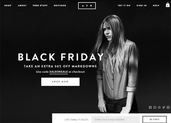
As we step into 2023, typography in web design continues to evolve, reflecting shifts in aesthetics and technology. One of the standout trends is the use of variable fonts, which allow designers to manipulate weight, width, and other properties seamlessly. This flexibility not only enhances creativity but also improves website performance by reducing the number of font files loaded. Additionally, we’re seeing a resurgence of bold and oversized typography, which captures attention and plays a crucial role in creating visual hierarchy. Colorful typography, where text is styled with gradients and dynamic hues, is also becoming increasingly popular, adding a playful touch to user interfaces.
Another noteworthy trend is the integration of custom typefaces that reflect brand identity, making websites more memorable and distinct. The use of asymmetrical layouts is also gaining traction, where typography breaks free from traditional grid-based designs, creating a more organic and intriguing visual flow. Lastly, minimalist typography continues to thrive, with an emphasis on clean lines and ample white space, ensuring readability while enhancing the overall user experience. These trends not only redefine web aesthetics but also shift the way users interact with digital content.
How to Improve Readability and User Experience with Effective Typography
Effective typography is a vital component in enhancing both readability and user experience on your blog. To start, consider using fonts that are easy to read and visually appealing. Sans-serif fonts like Arial or Helvetica are often recommended for digital content because of their clean lines and simplicity. Additionally, pay attention to the font size; a general guideline is to use at least 16px for body text, ensuring it’s legible across different devices. You can further improve readability by using line spacing (also known as leading) of 1.5 to provide enough white space, which helps guide the reader's eye seamlessly along the text.
Another important aspect is the use of contrasting colors between the text and background. A stark contrast makes content more accessible, especially for users with visual impairments. When employing a hierarchical structure, use headings (H1, H2, H3) effectively to break up content into digestible sections. This not only enhances readability but also aids in navigation, allowing readers to skim for relevant information easily. Remember, well-structured typography not only improves user experience but also contributes positively to your SEO efforts by keeping visitors engaged longer on your site.